The Challenge
Play it Retro’s dated logo and colors lack cohesion and nostalgic feel, undermining credibility, recognition, and trust as a gaming retailer.
The Solution
Play it Retro's rebrand infuses retro-inspired nostalgia with a modern twist. The brand can appeal to long-time gaming enthusiasts and attract new customers, positioning itself as both timeless and relevant in today’s market.
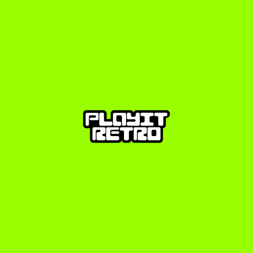
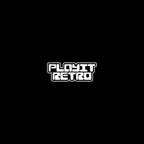
The Wordmark
As part of the rebrand, I developed a custom logotype using a grid system to ensure precision and consistency. I chose a monospaced style to evoke the look and feel of early digital-era typography, with tight kerning inspired by the mathematical spacing constraints of older systems. To introduce a contemporary touch, I incorporated rounded edges and bubble graffiti-inspired forms, balancing nostalgia with modern aesthetics. Finally, I created logo variations for both light and dark backgrounds, prioritizing legibility and strong visual contrast.

The Logomark
The logo mark was developed using the same design language as the logotype for visual consistency. To ensure it could stand independently, I designed it to be symmetrical and visually balanced. Drawing inspiration from retro technology, I based the mark on bracket forms, a subtle nod to early digital interfaces. The project’s color palette further reinforces this nostalgia, referencing the iconic monochrome green monitors of the past.


Deliverables
To build authenticity and make the brand real, I created a set of branded deliverables. These included a photo of a persona customer holding a branded shopping bag, a lifestyle shot of a laptop featuring branded stickers, apparel merchandise, and a series of title cards, all reinforcing the brand’s cohesive identity.